A strong identity should work in the places where people actually meet your business. It needs to feel like one brand on a website, a social post, a printed piece and a product label, even when the layouts are different. That consistency comes from a clear idea and a small set of useful design decisions.
Find the idea before choosing the style
Start with what the business does, who it speaks to and what it needs people to remember. A visual direction becomes easier to judge when it has a job. If the intended impression is calm and considered, for example, every choice of type, colour, imagery and pace should support that feeling.
Gather references, but describe why each one works. ‘We like this blue’ is less useful than ‘the restrained palette makes the product feel precise’. That distinction helps a designer create something specific to your brand rather than reproduce a reference.
Design a system, not a single mark
The logo needs to be legible and flexible, but it rarely carries a whole identity alone. Typography, spacing, colour relationships, image direction and recurring graphic details do much of the everyday work.
Consider the practical versions early: a horizontal and compact logo, a simple social avatar, light and dark uses, and layouts that still work when a headline is long. A beautiful presentation image cannot answer those questions on its own.
Test it on real applications
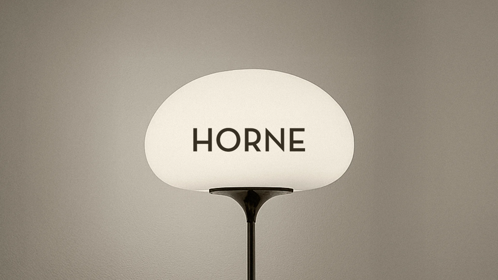
Place the proposed identity on the things the business will actually use. For one brand that may be packaging and a shelf label; for another, a mobile website and a pitch deck. Mockups help people imagine the work, but plain production layouts reveal whether the system is truly useful.
Look for the awkward cases: small sizes, busy photography, several levels of information, different aspect ratios and a limited print budget. Fixing those cases during the design phase is much easier than solving them one by one after launch.
Make consistency easy for the next person
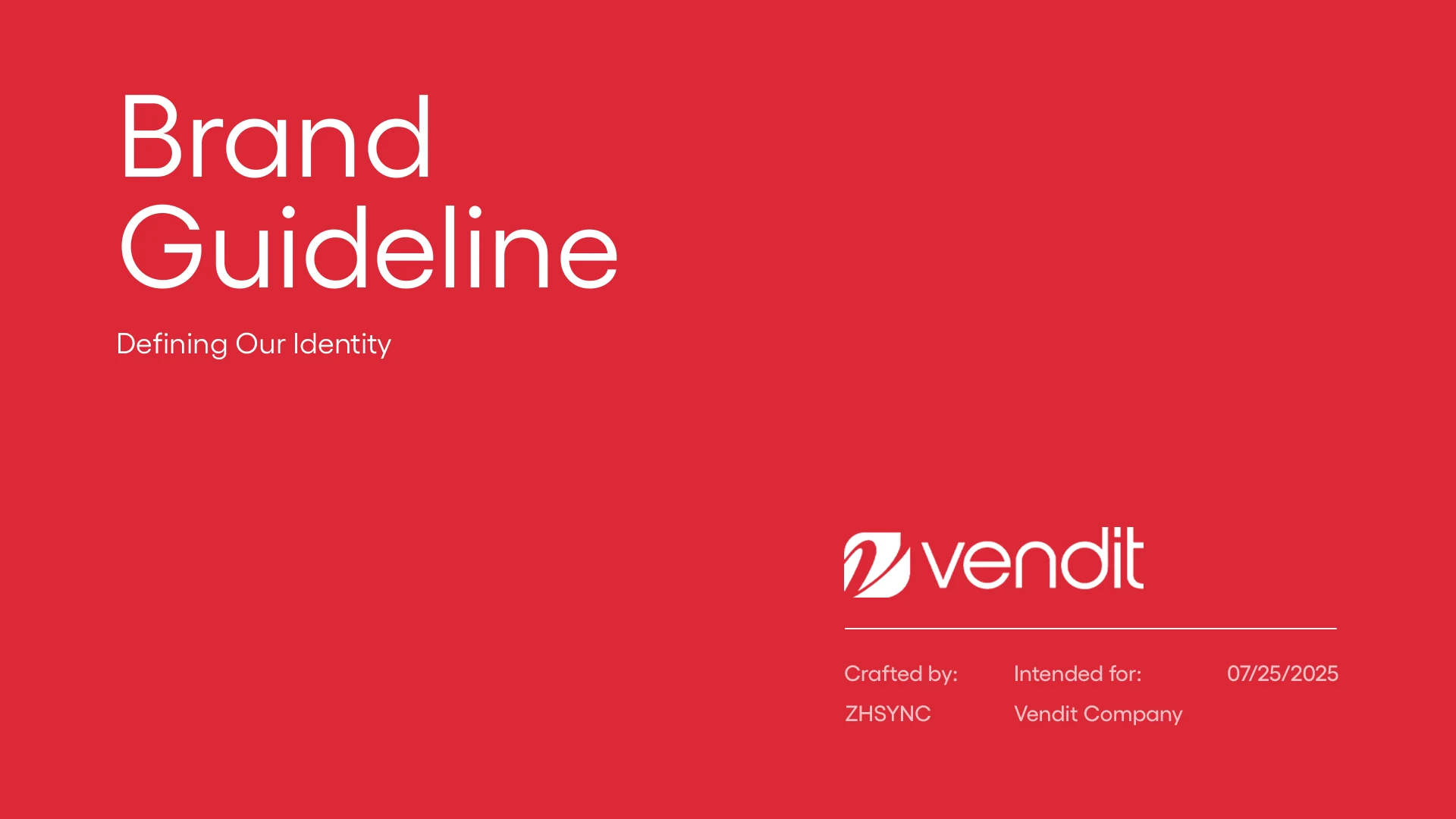
An identity is only as consistent as its everyday use. Deliver organised logo files, colour values, font information and simple examples of correct application. If several people or suppliers will use the brand, a short guide can prevent repeated decisions and accidental variations.
A good identity gives the team enough structure to stay recognisable and enough flexibility to make new work. The aim is a visual language people can keep using, not a collection of perfect mockups that only works once.
At Imagine Studio, we build identities around a clear direction and test them across the touchpoints a brand needs. If you are planning a new identity, start with the real places it must show up.
Discuss your project ↗