
BRAND IDENTITY · PACKAGING · SOCIAL MEDIA
Bluedew.
Skincare, with room to breathe.
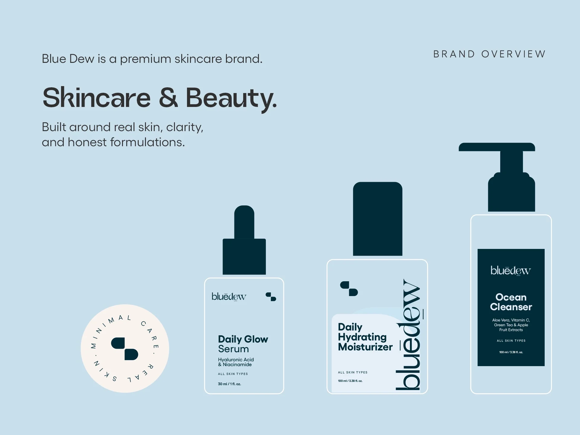
Bluedew is a premium skincare identity built around real skin, clarity and honest formulations. The visual system moves from a distinctive wordmark and symbol into a considered palette, product packaging and social content.
Selected collaborative work · Brand presentation supplied by the project team
01 / THE BRAND
Care in every detail.
A calm blue world frames a range of everyday skincare essentials.

02 / IDENTITY
A mark made to last.
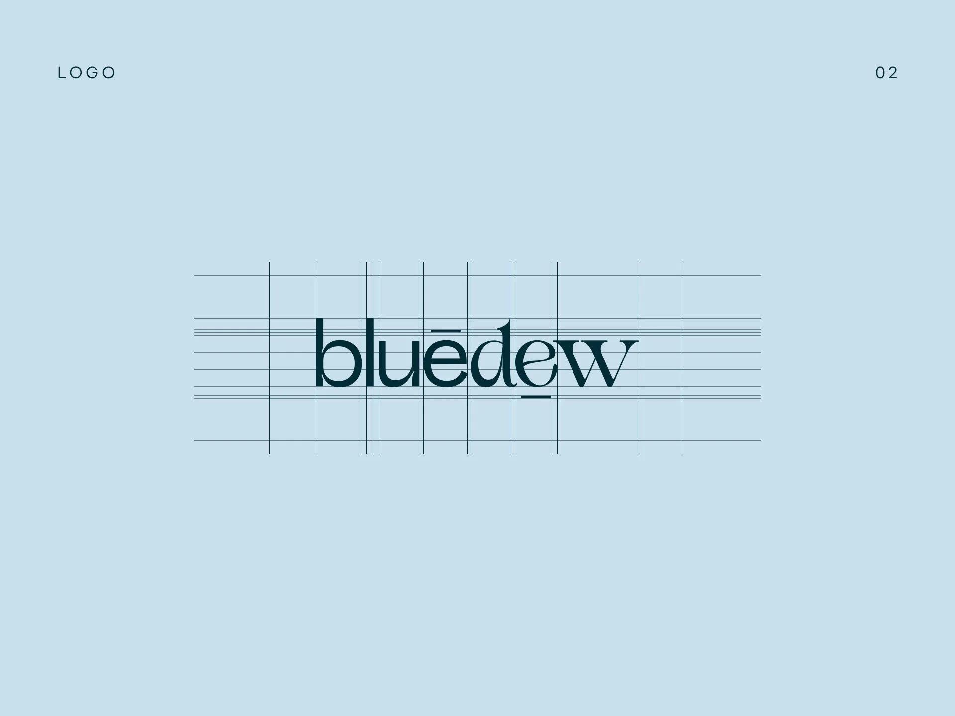
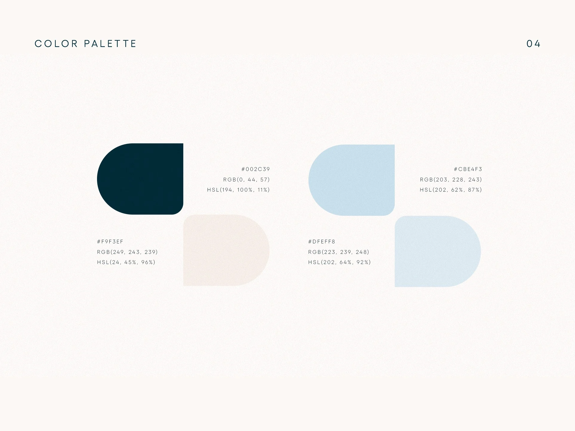
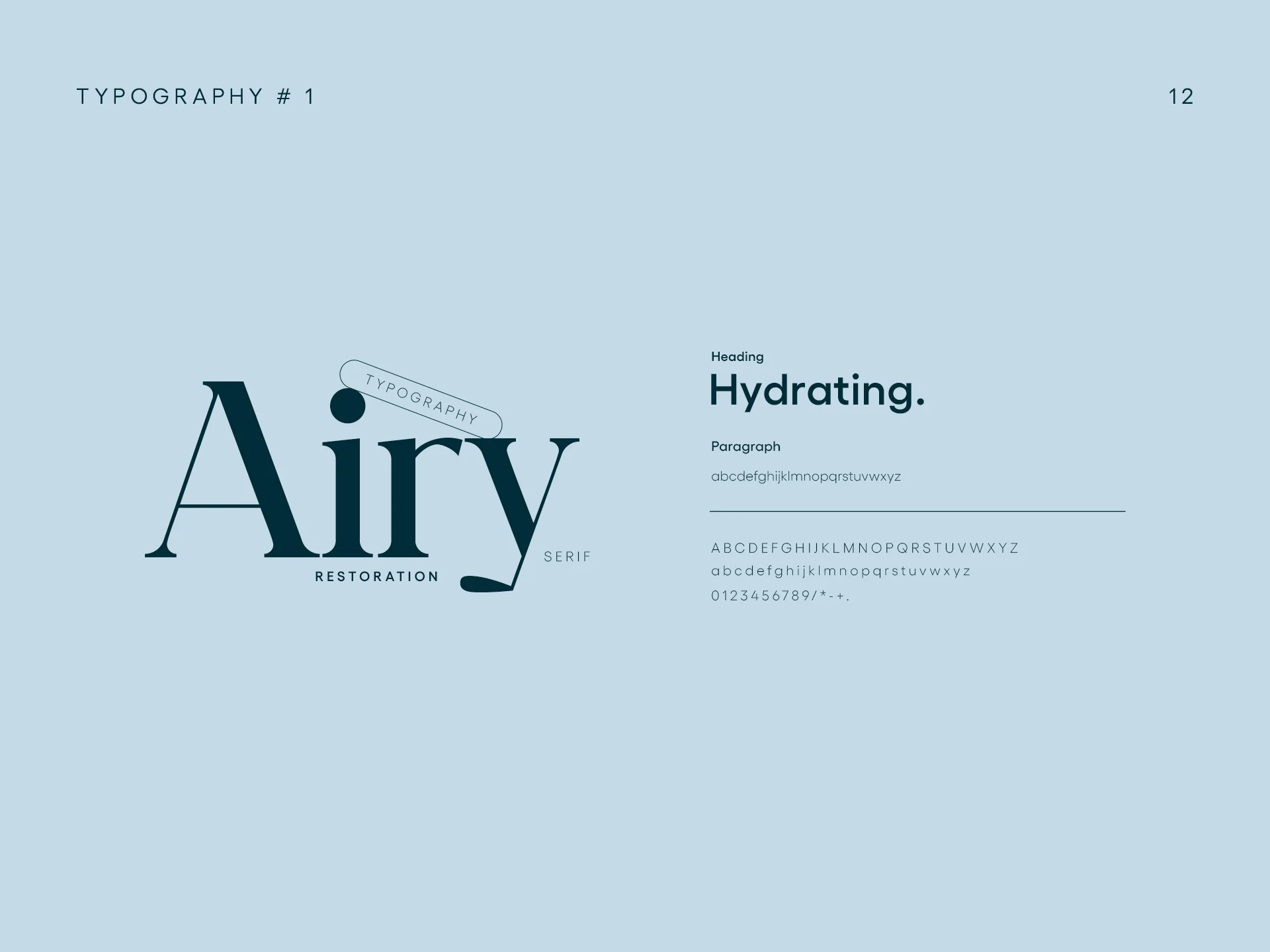
The wordmark, paired symbol and four-colour palette create a recognisable foundation. The presentation also explores how the typography flexes between product information and expressive brand moments.


03 / PRODUCT & PACKAGING
The identity in hand.
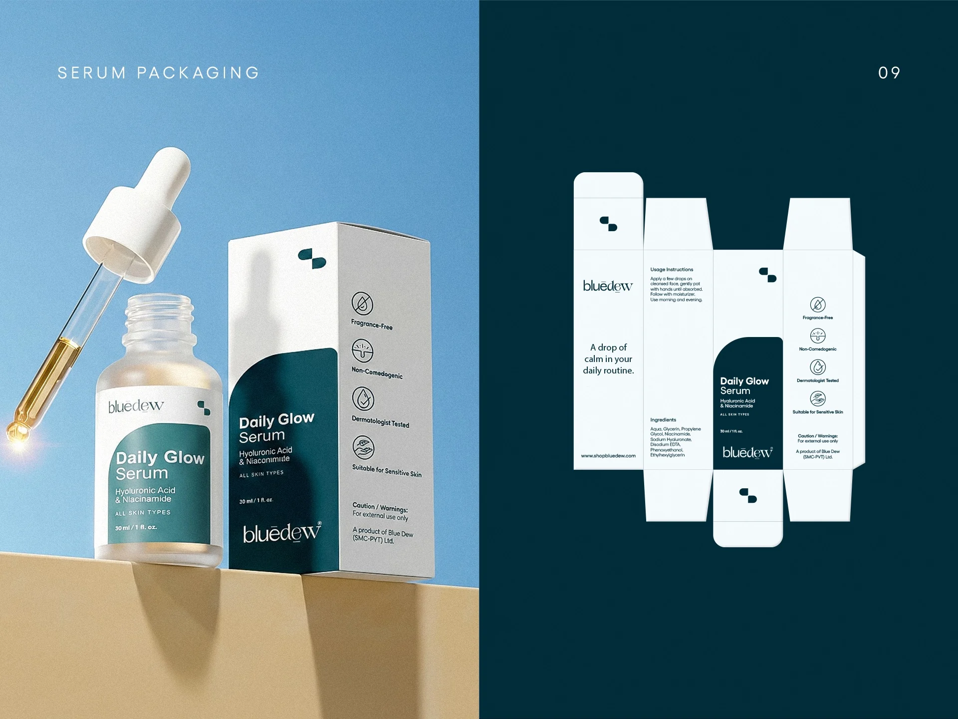
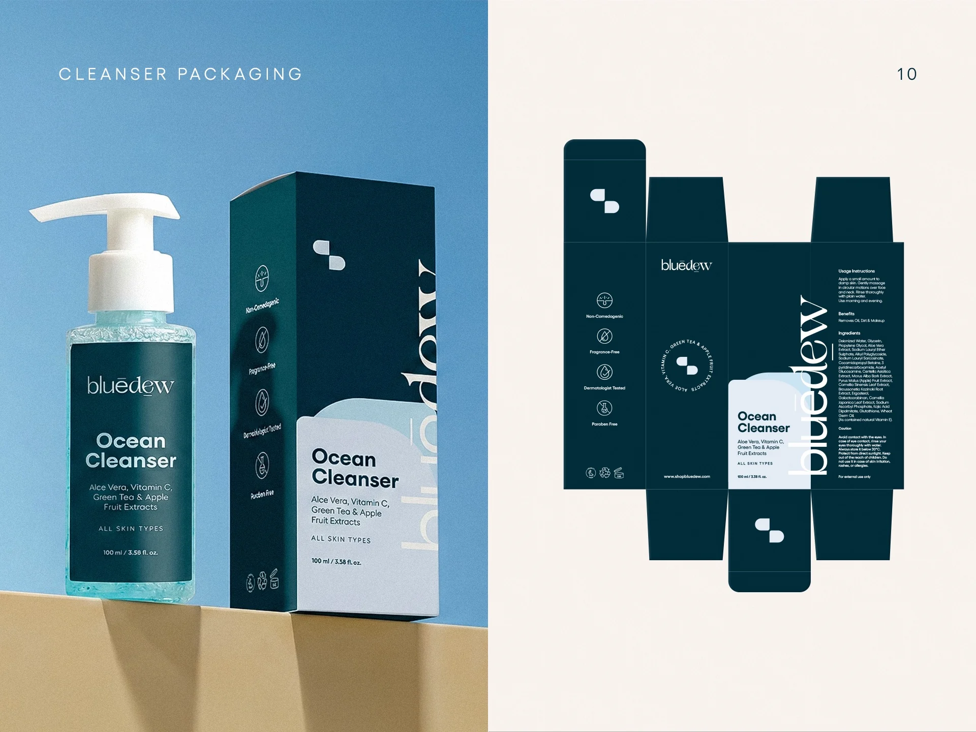
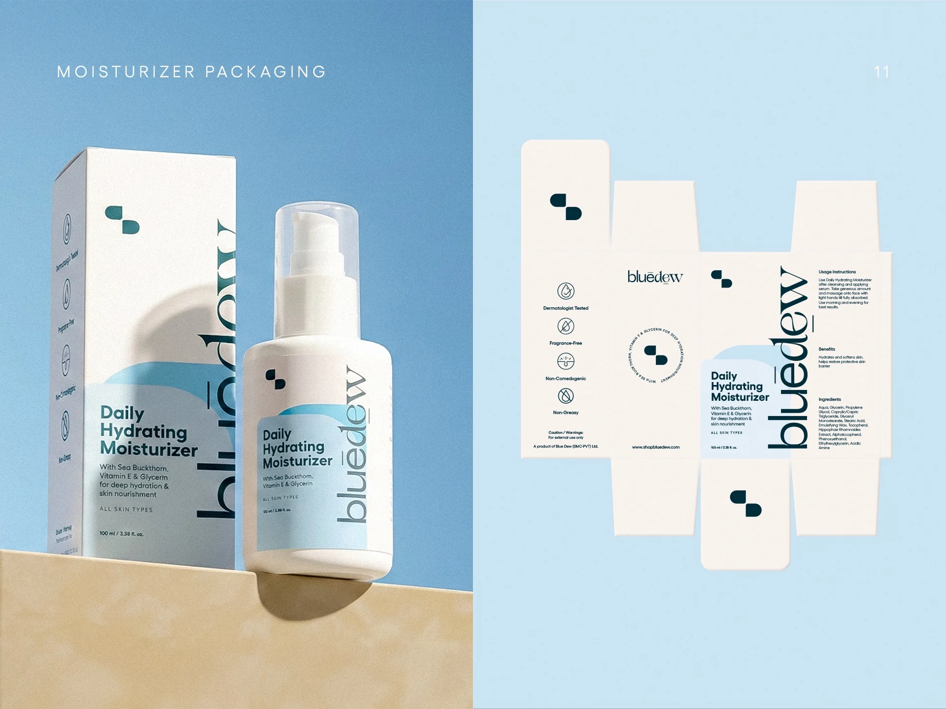
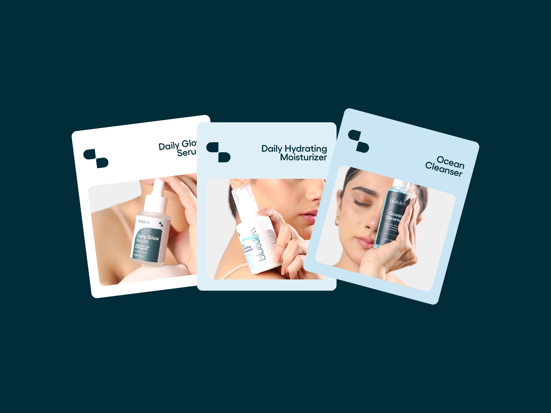
Serum, cleanser and moisturizer carry the same design language across bottles, cartons and unfolded packaging artwork.
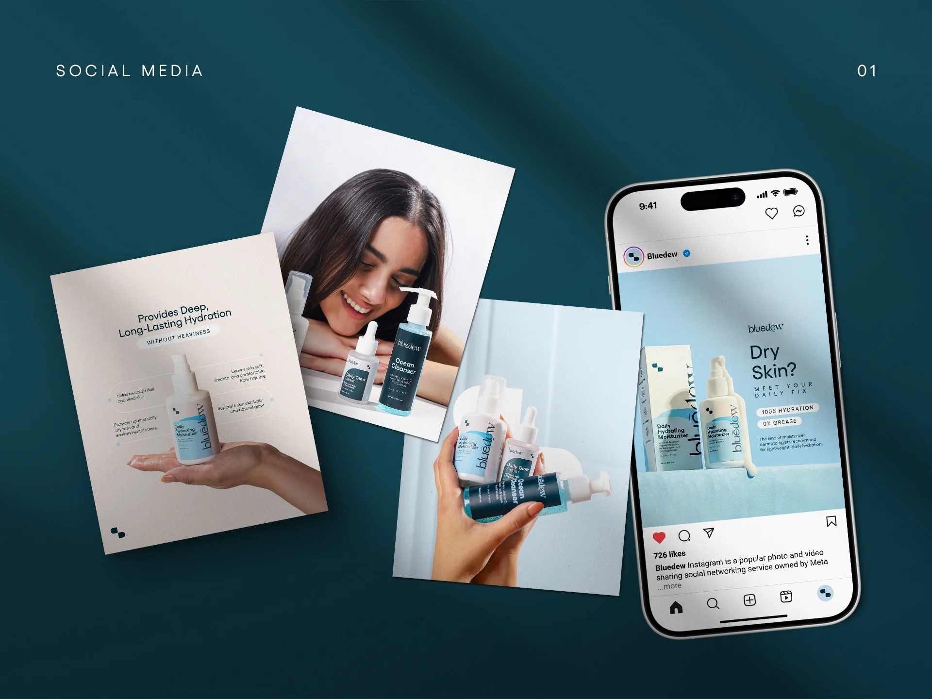
04 / CAMPAIGN & SOCIAL
A world beyond the label.
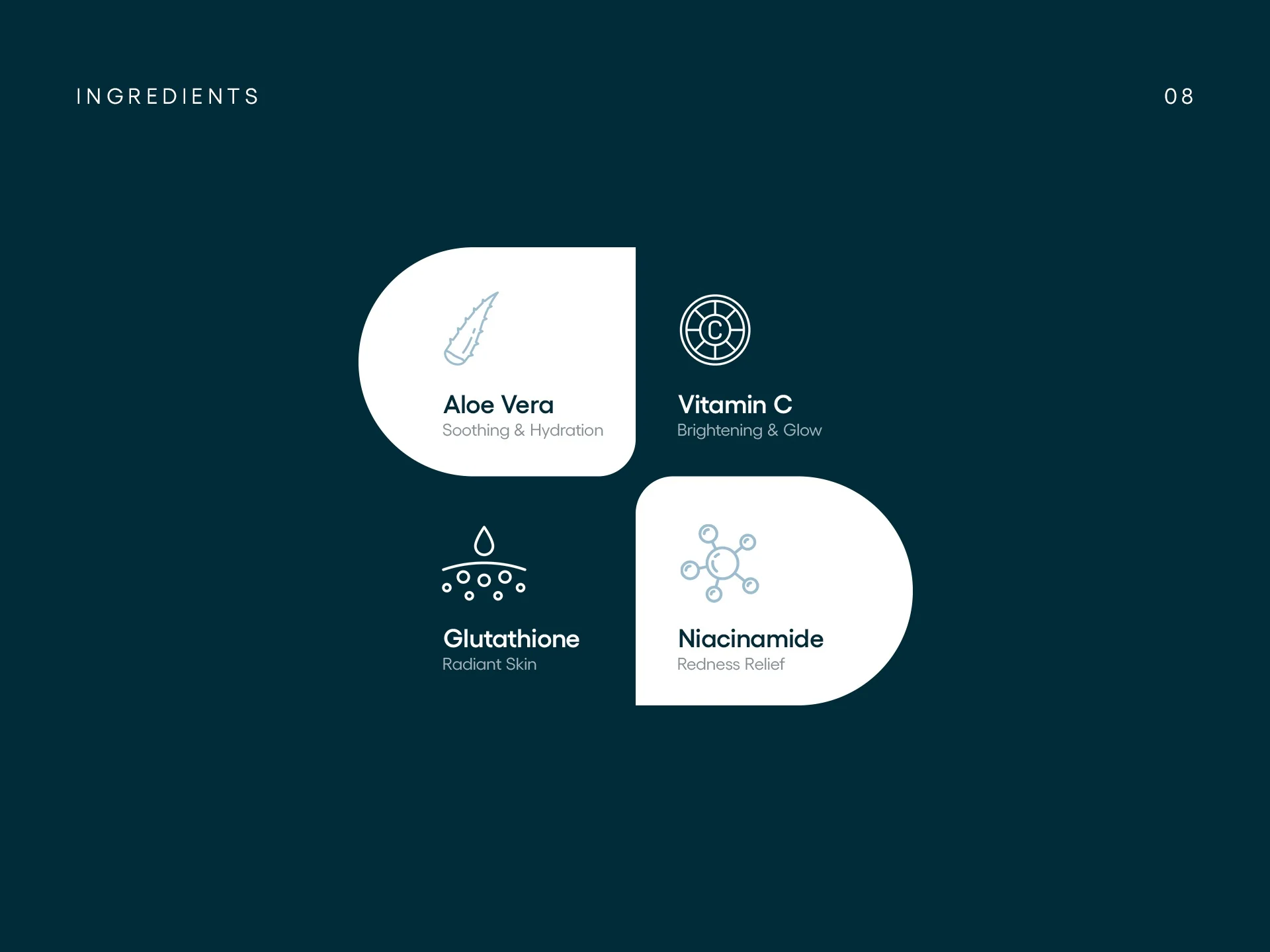
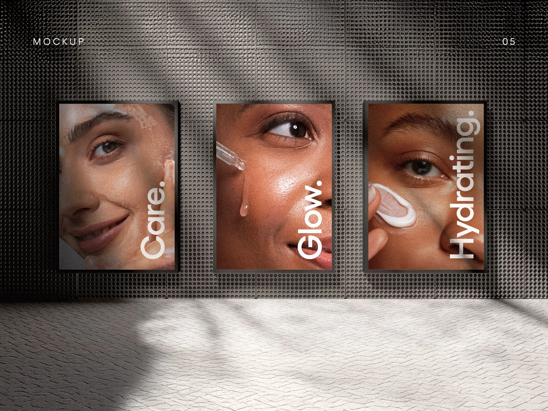
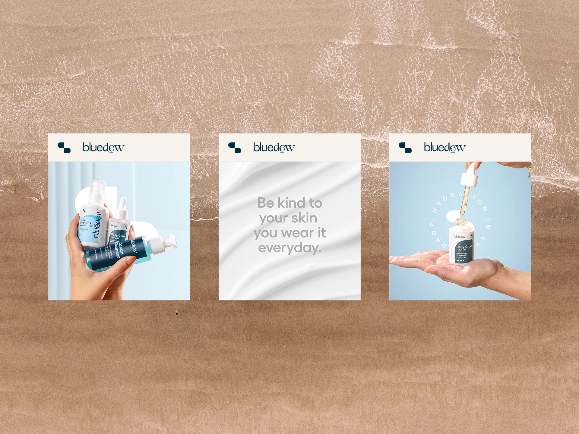
Ingredient storytelling, photography and campaign applications carry Bluedew into editorial and social spaces.

PROJECT NOTE
Imagery on this page is taken from the supplied Bluedew branding presentation. This is selected collaborative work; no launch or performance claims are made.