
Selected design work
VENDIT
A usable identity for automated retail
Brand guidelines · logo system · visual applications
01 / OVERVIEW
The starting point.
Vendit is presented as a technology-led vending platform offering everyday essentials through automated machines. Its identity has to work across small on-screen moments, machine surfaces, marketing material and partnerships. The design task is therefore one of consistency: the mark, colours, type and imagery need rules that another person can apply correctly.
THE BRIEF
The design task.
Document a clear visual system for a retail experience that appears in several physical and digital contexts.
02 / DIRECTION
A visual language.
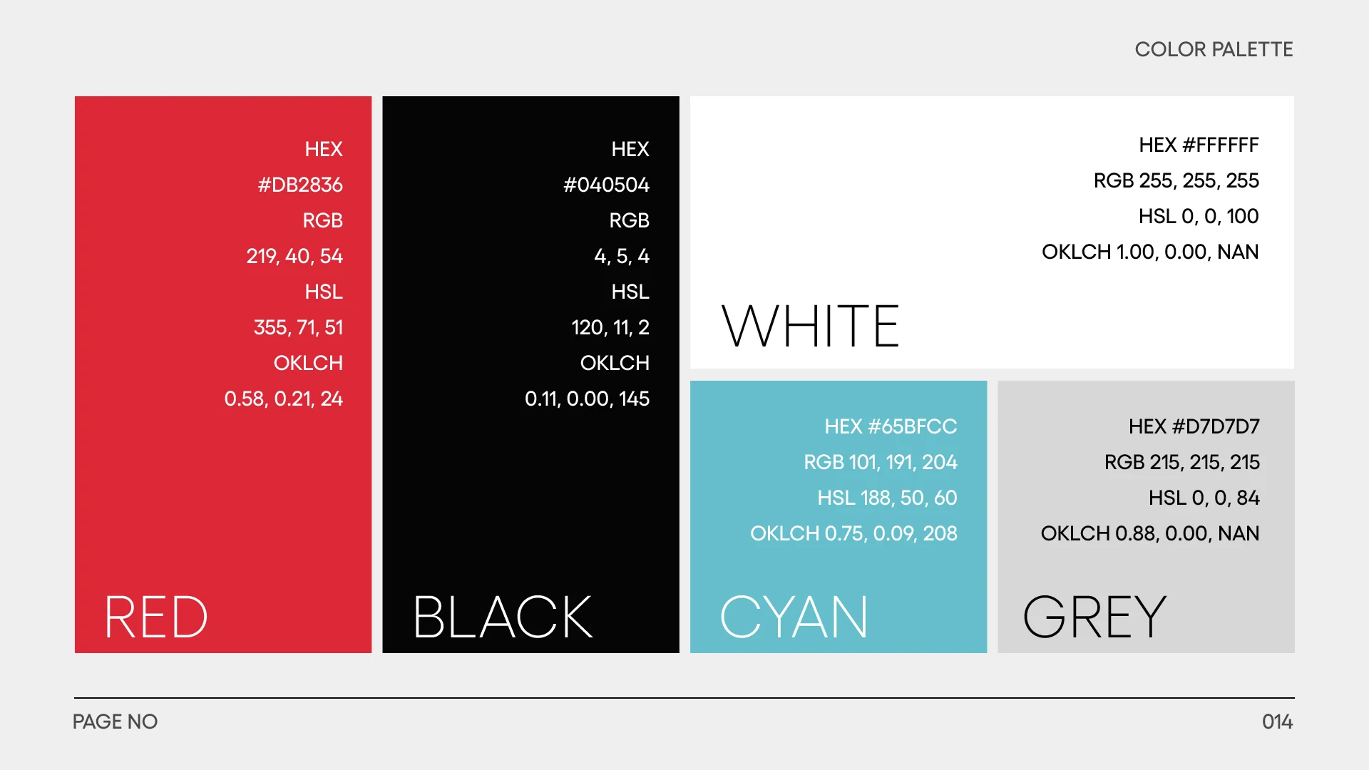
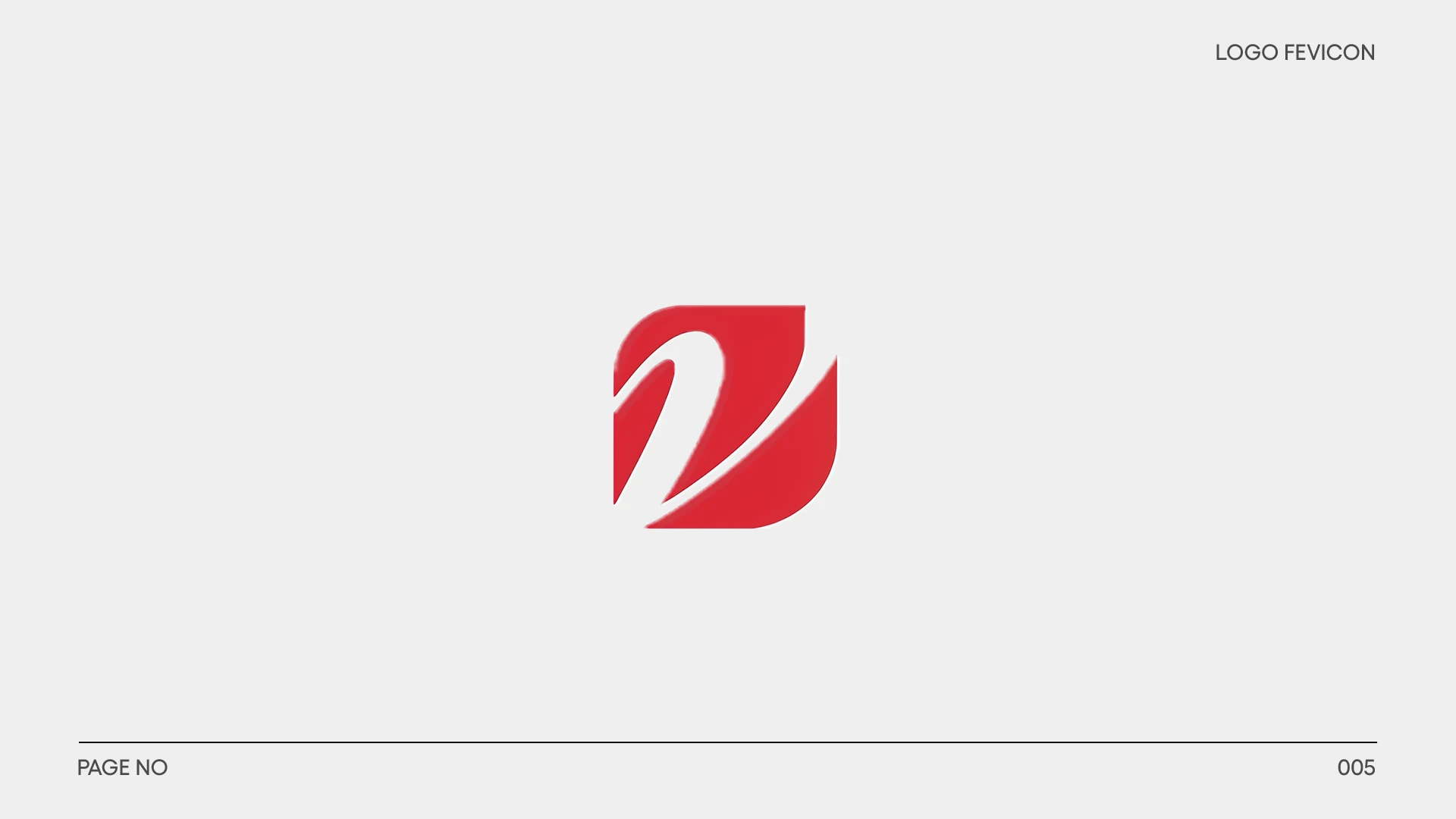
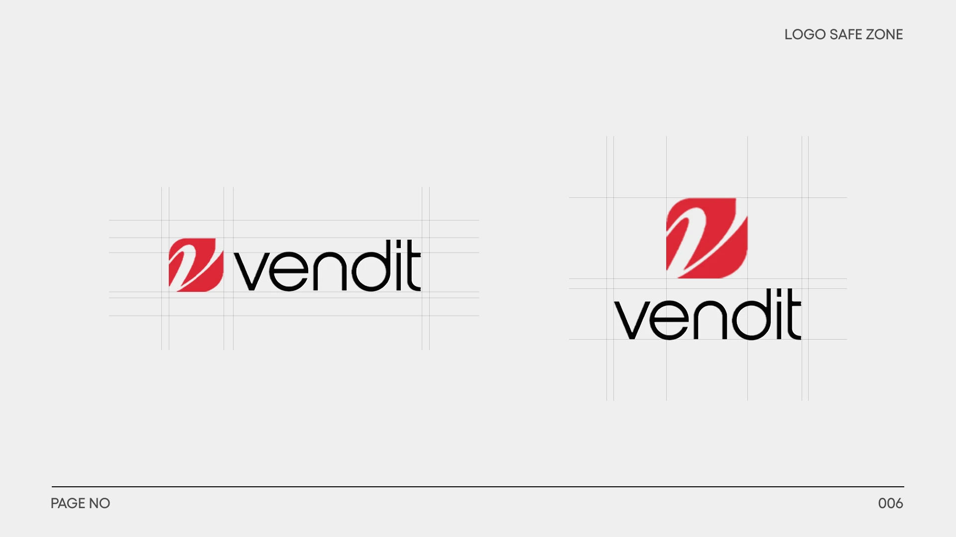
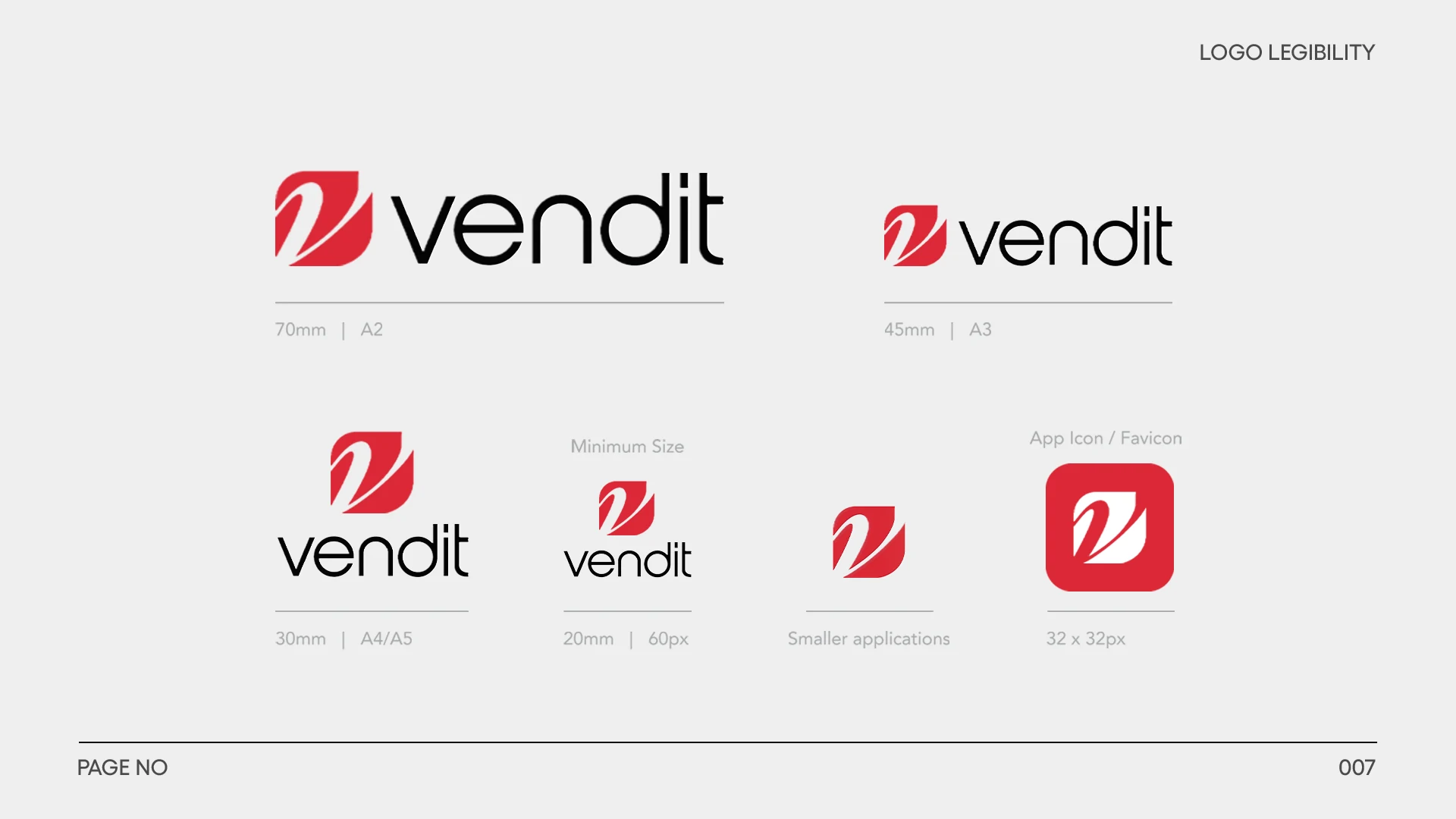
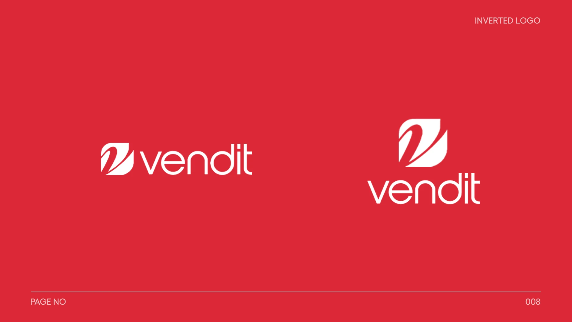
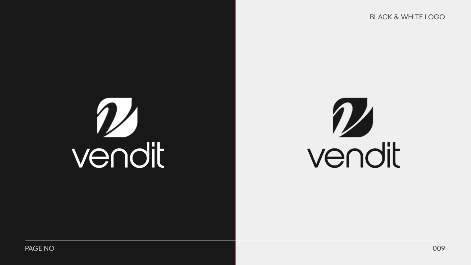
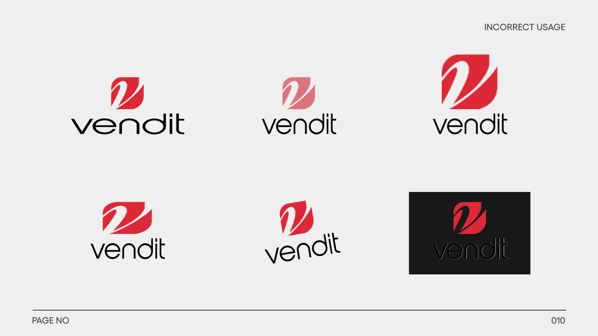
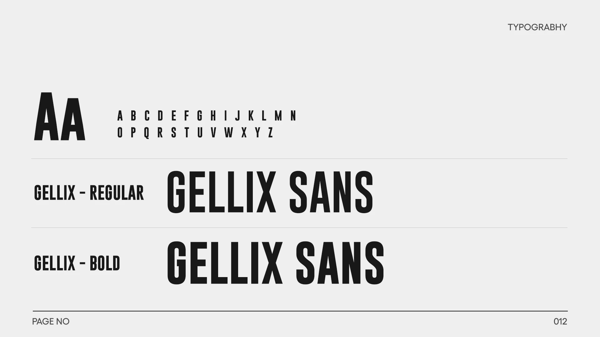
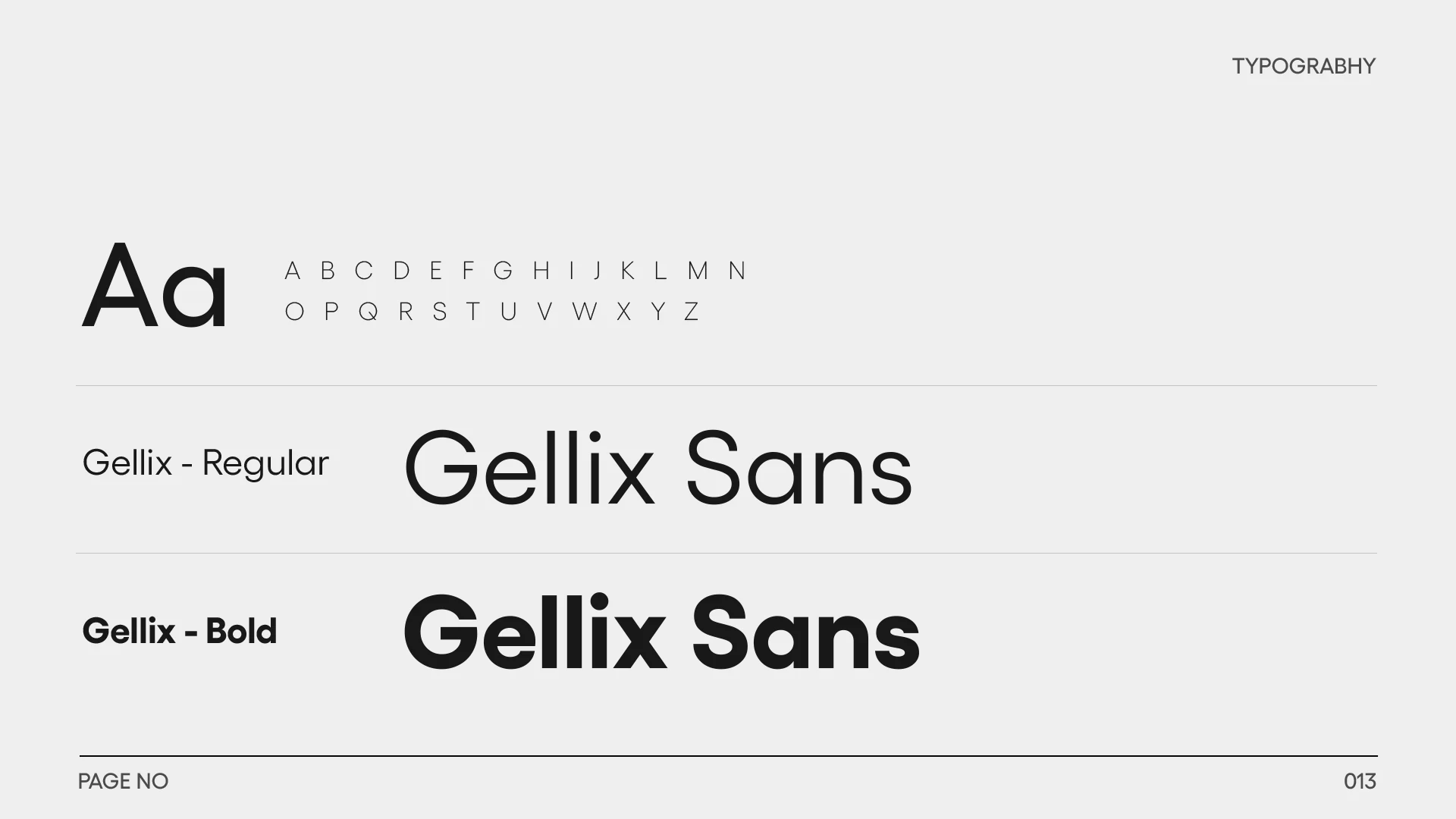
The red V symbol and lowercase wordmark are specified in primary, secondary and monochrome forms. The guide defines clear space, size and legibility, with correct and incorrect usage examples. A Gellix Sans type system and a palette of red, black, white, cyan and grey create a practical hierarchy for high-visibility communication.
03 / APPLICATIONS
The system in use.
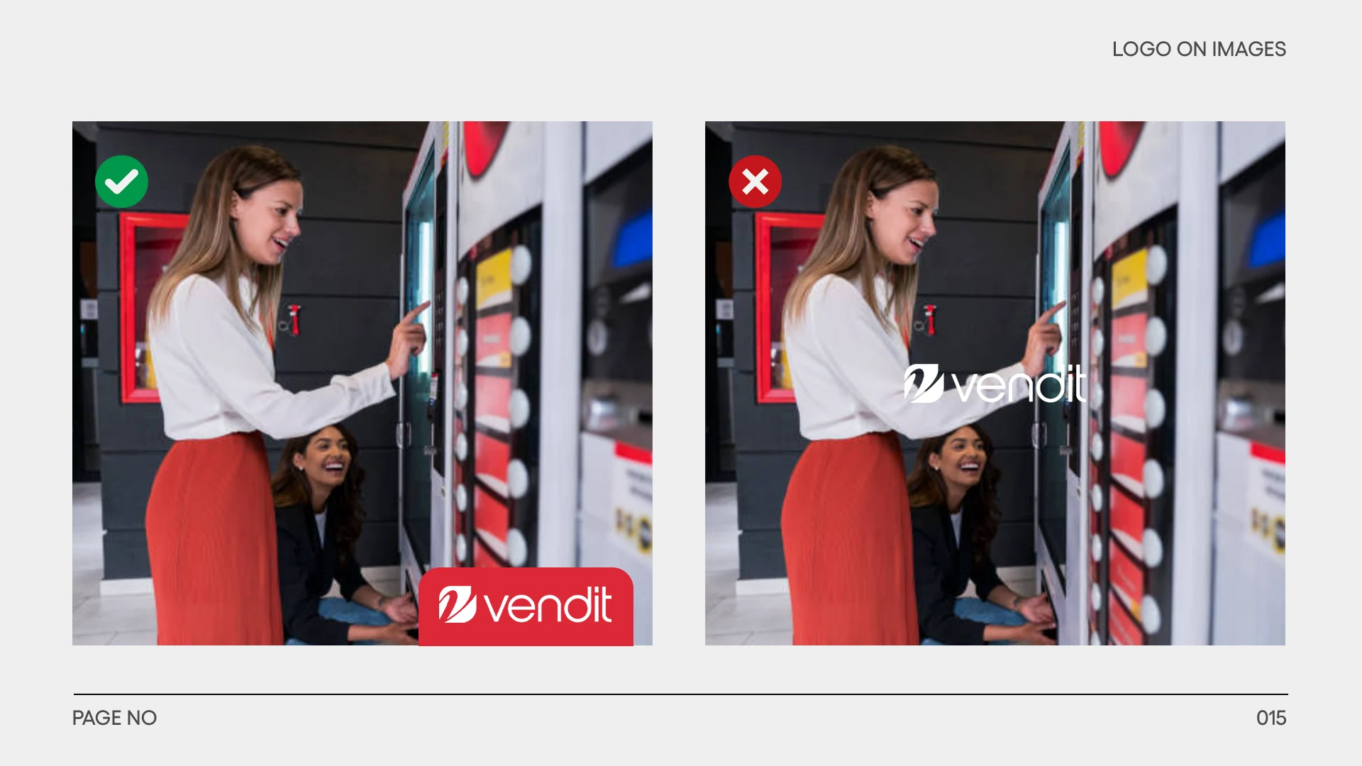
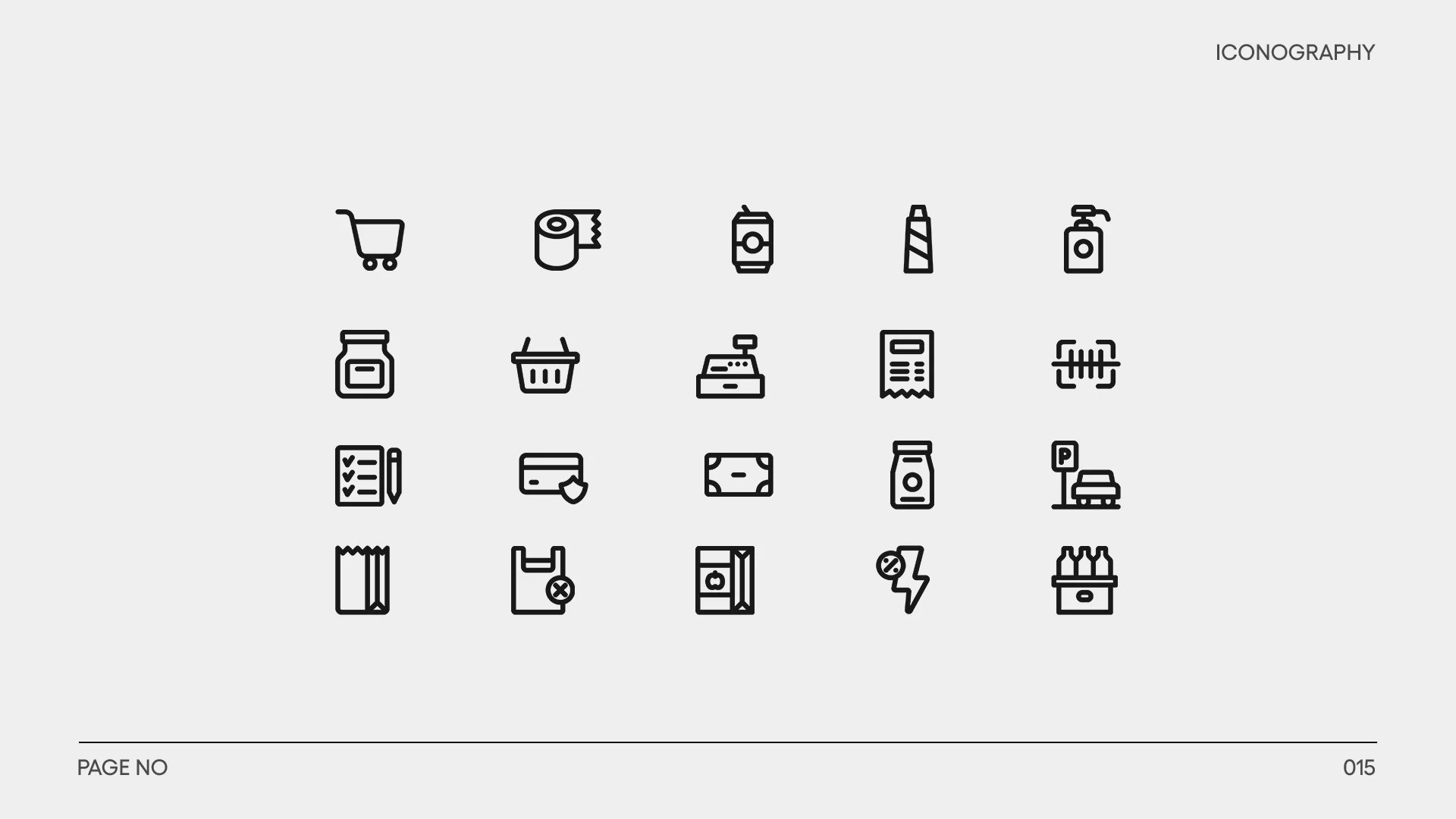
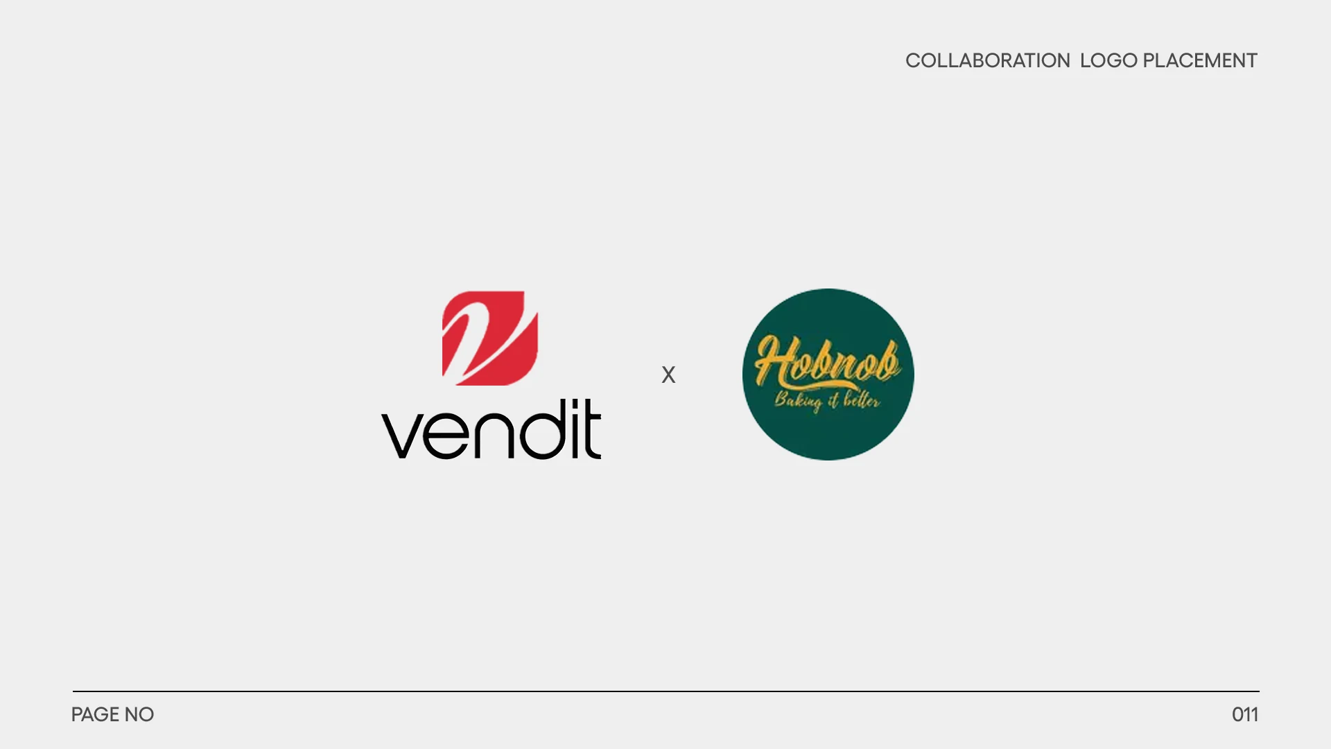
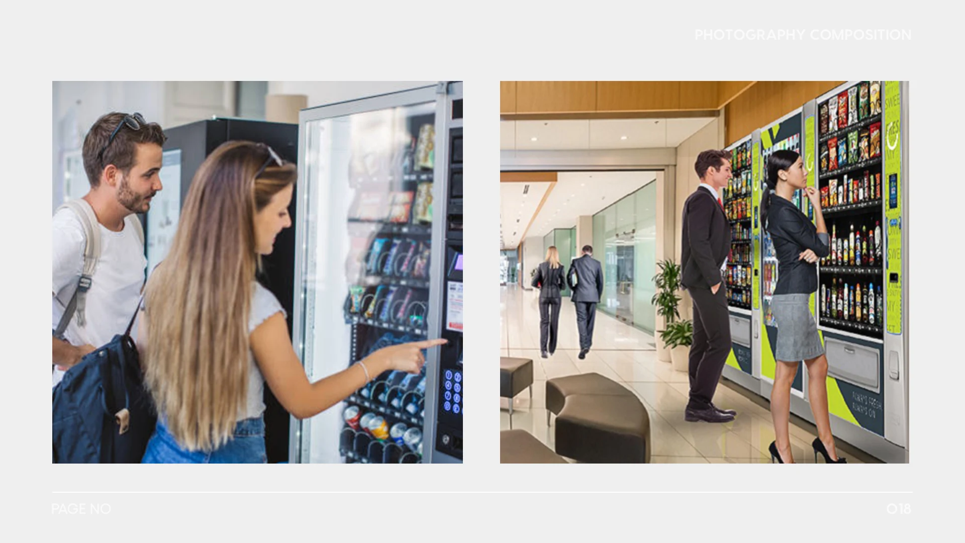
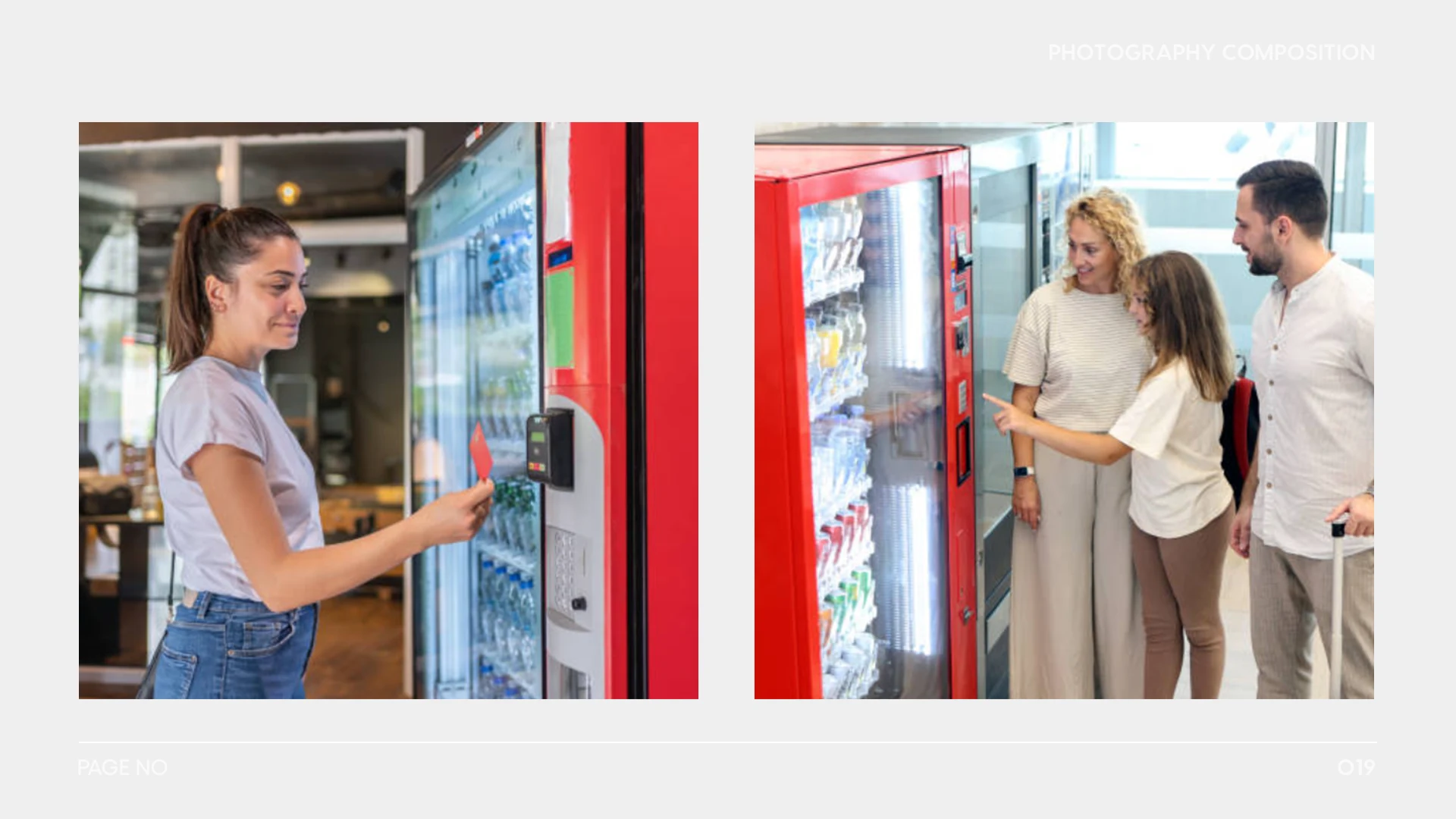
The guide extends beyond the logo to iconography, photography and co-brand placement. Vending-specific icons make the system useful in functional contexts, while examples on photographs show how to preserve contrast and clarity when the mark sits in a busy environment. The applications connect a set of rules to likely daily use.

Explore the full project gallery 16 more images +


PROJECT CREDITS
Selected work by Muhammad Ahtisham Khan. Collaborative project.