
Brand identity / packaging / art direction
Saki's
Luxury, handcrafted for her.
Brand identity / packaging / art direction
01 / OVERVIEW
The starting point.
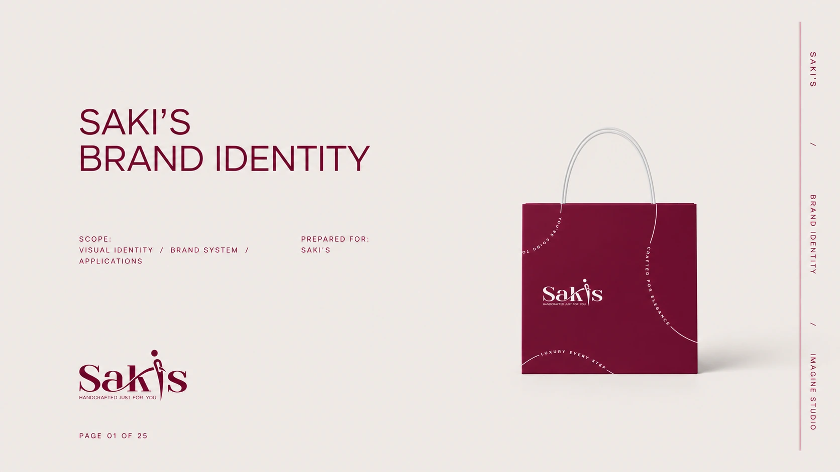
Saki's is a luxury women's footwear brand built around a simple belief: a pair of shoes should feel made only for you. The goal was to give that promise an identity as refined as the product — elegant, feminine, and unmistakable wherever it appears.
THE BRIEF
The design task.
Create a complete brand identity for Saki's and carry it through every touchpoint of the luxury experience — from the logo and packaging to the insole, the shopping bag, and the moment the box is opened.
02 / DIRECTION
A visual language.
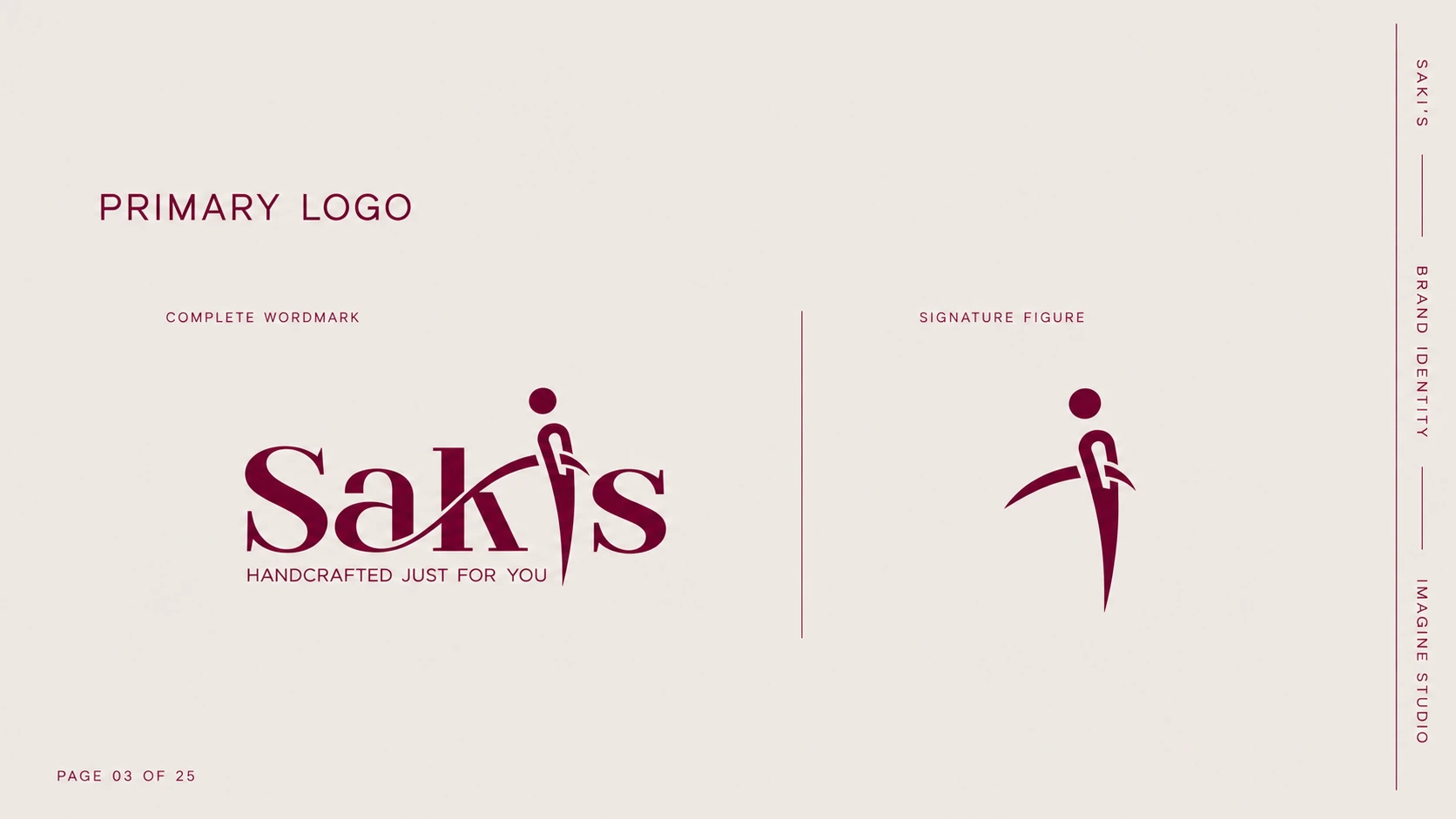
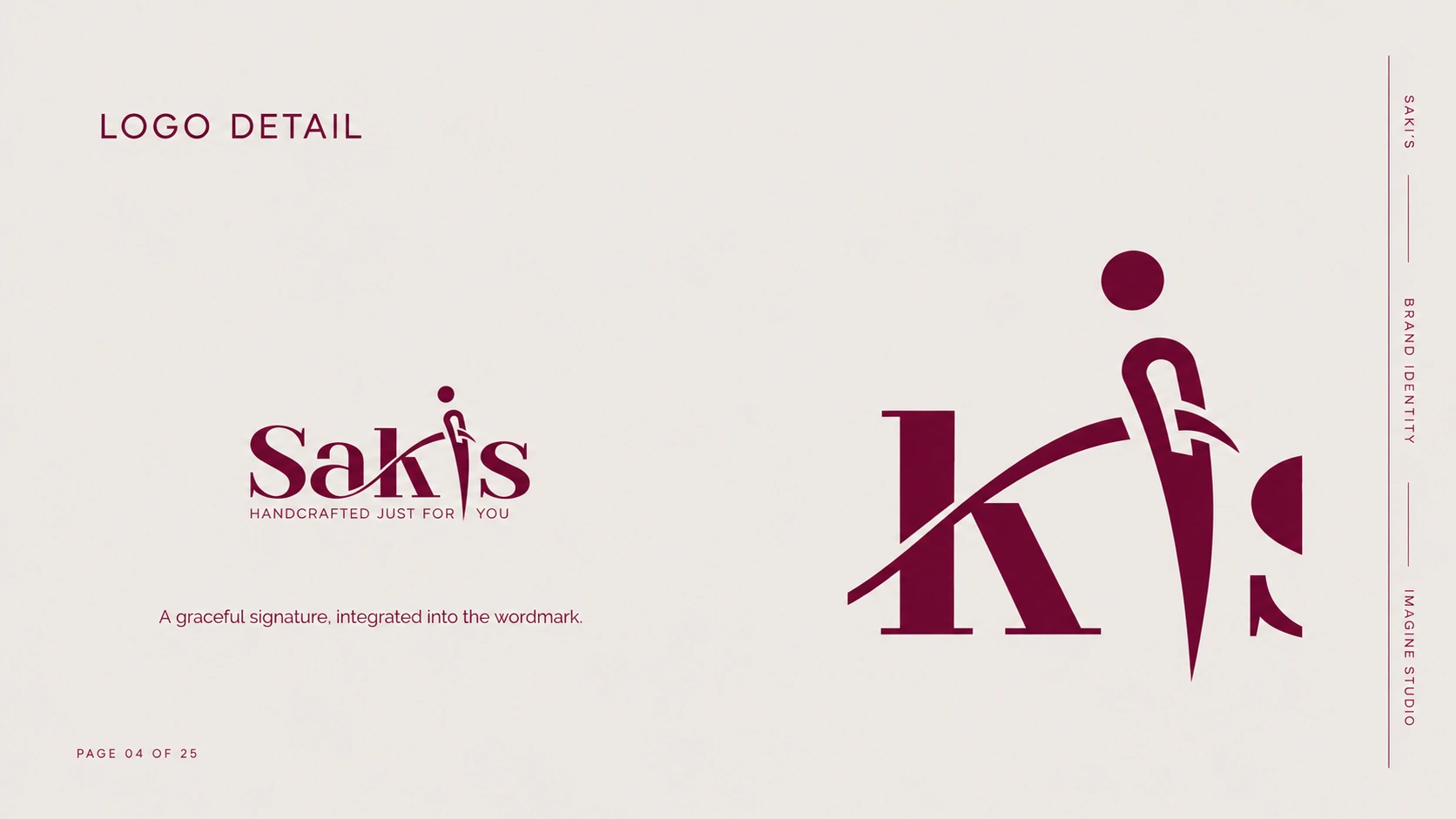
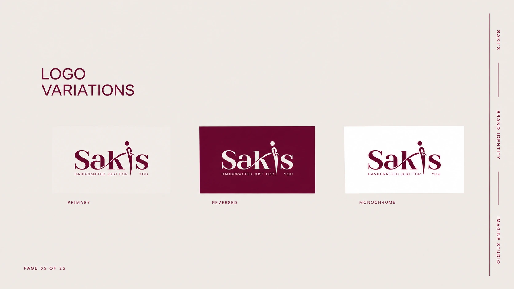
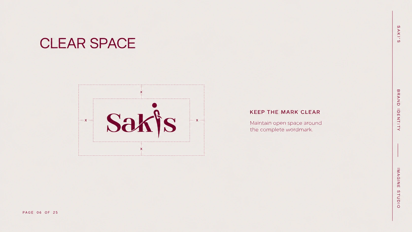
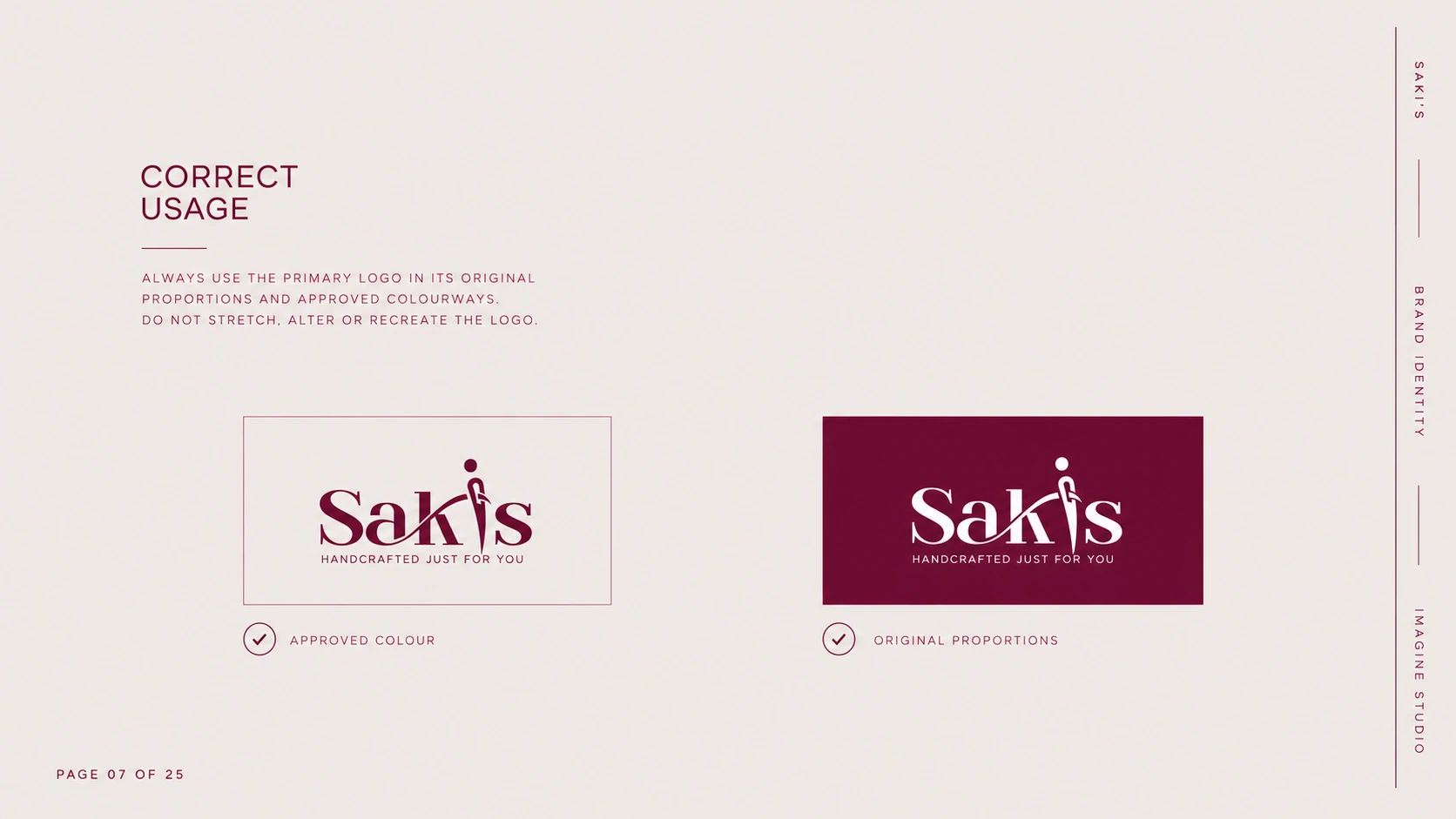
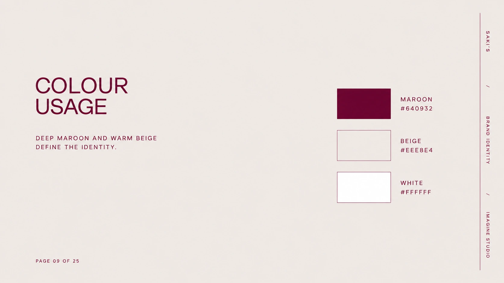
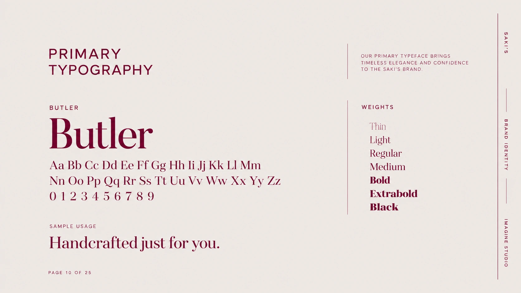
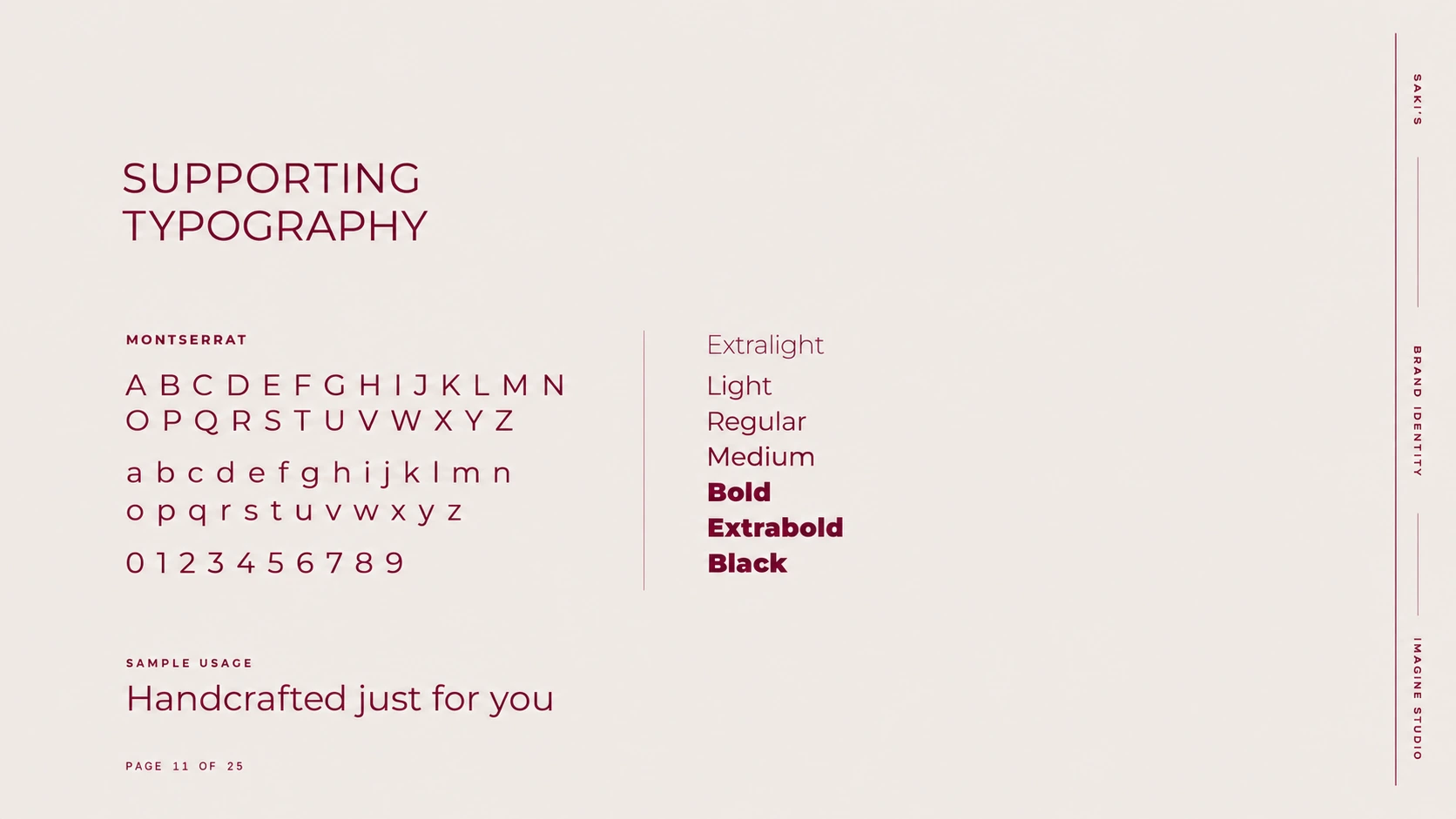
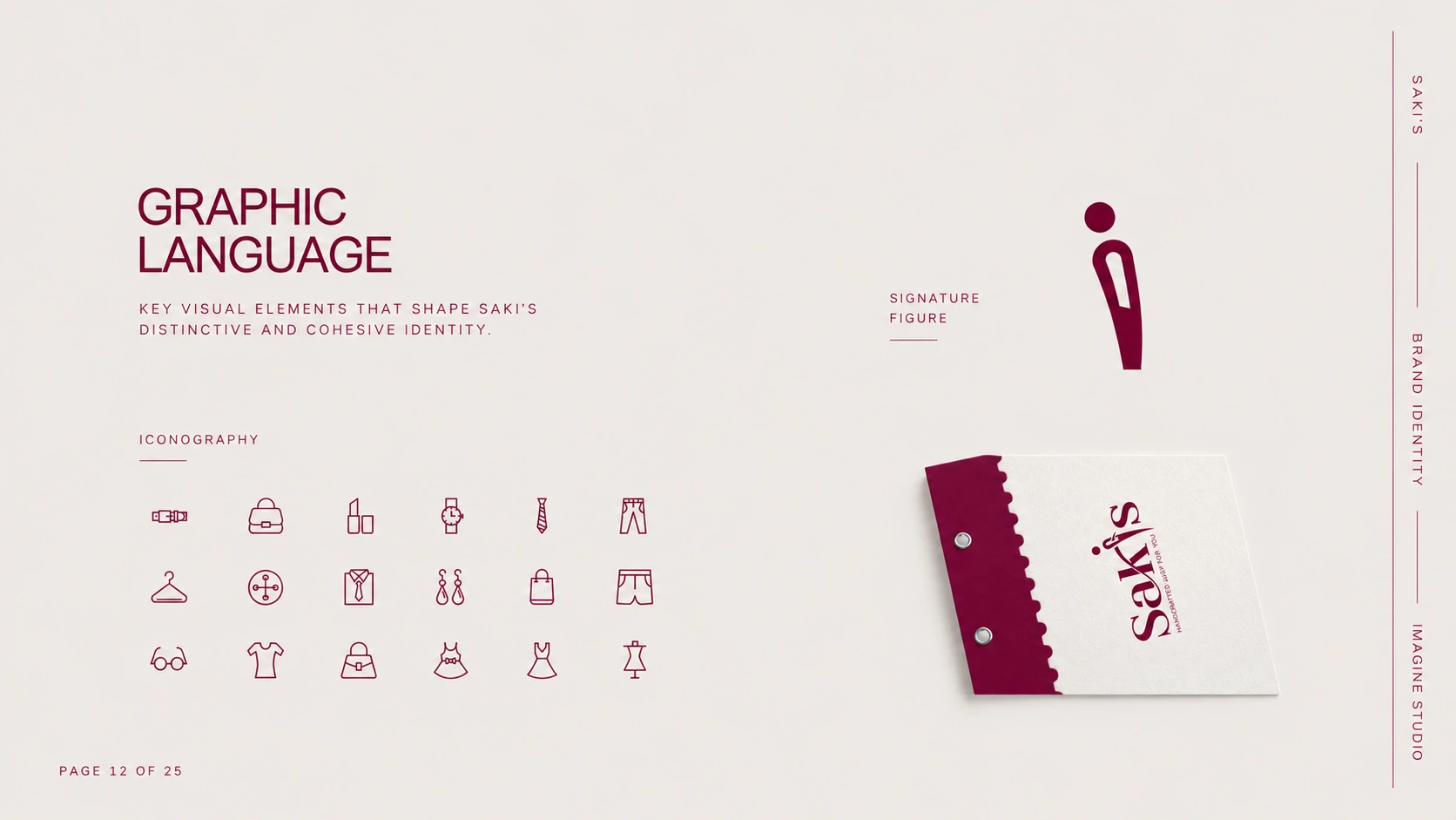
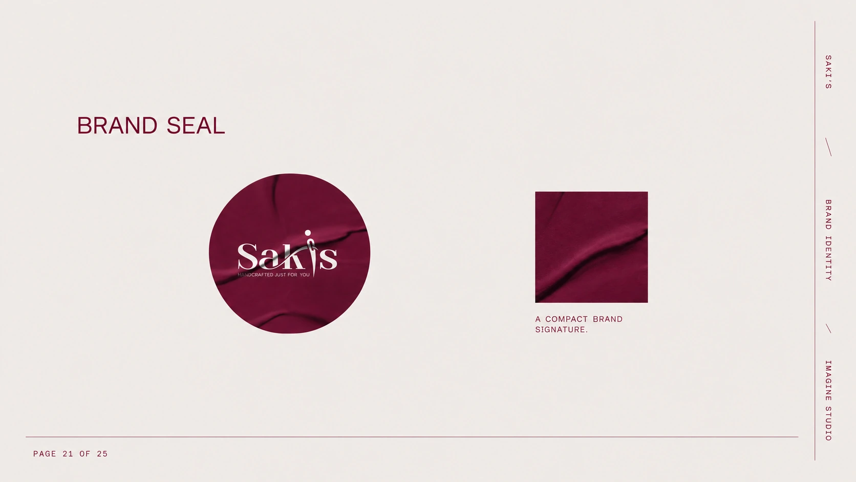
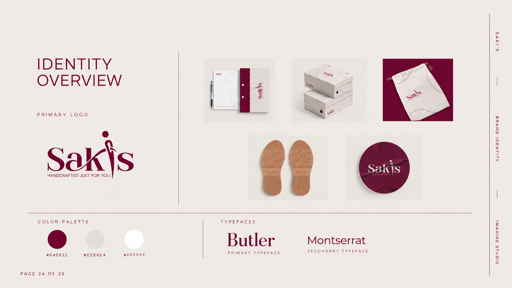
'Handcrafted just for you' became the idea behind the visual language. A deep maroon paired with warm beige sets a tone of quiet luxury, while the Butler serif brings elegance and Montserrat keeps everyday information clear. A signature figure — abstract, graceful, unmistakably feminine — works as a compact mark across seals, patterns, and small applications.
03 / APPLICATIONS
The system in use.
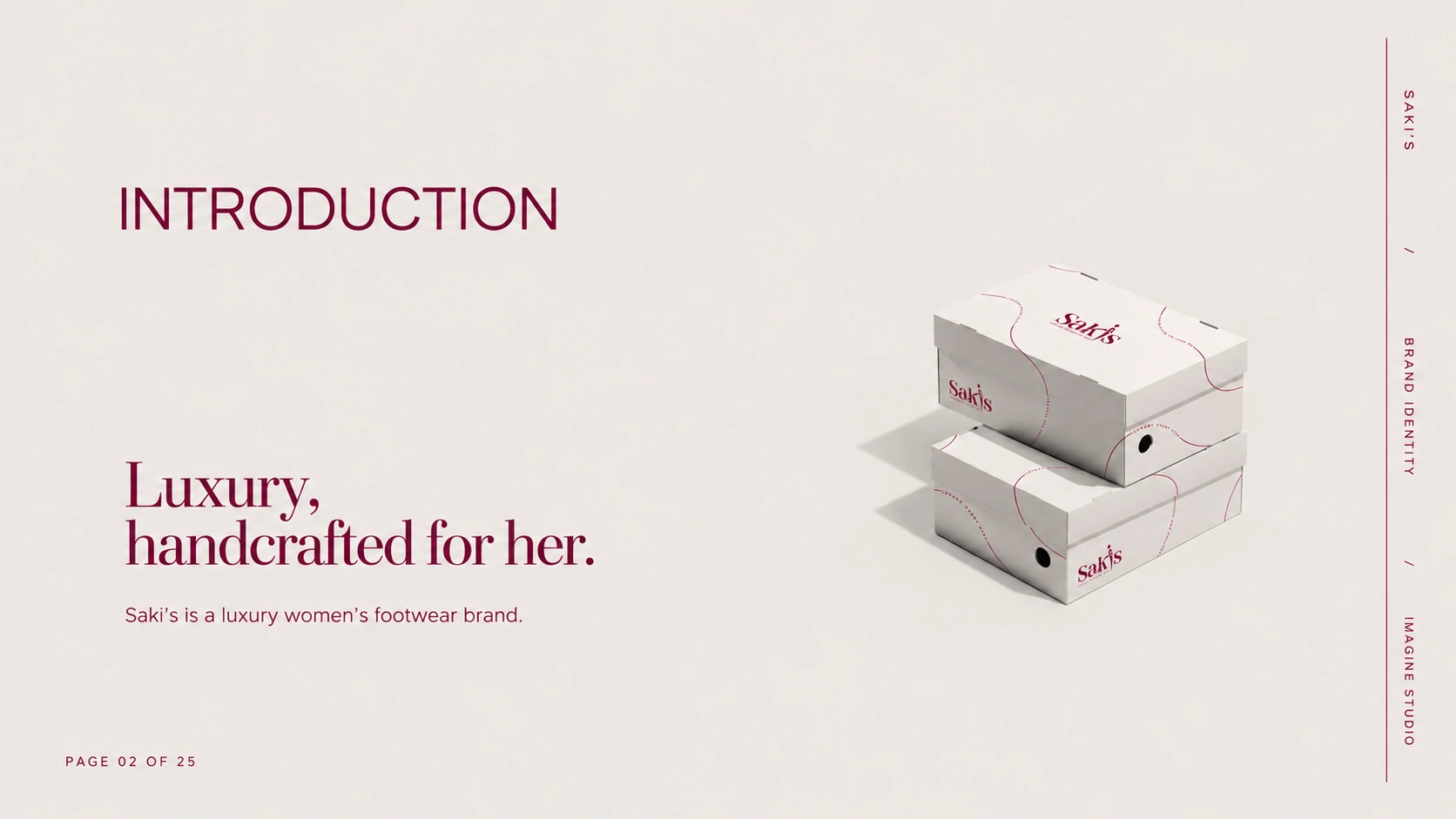
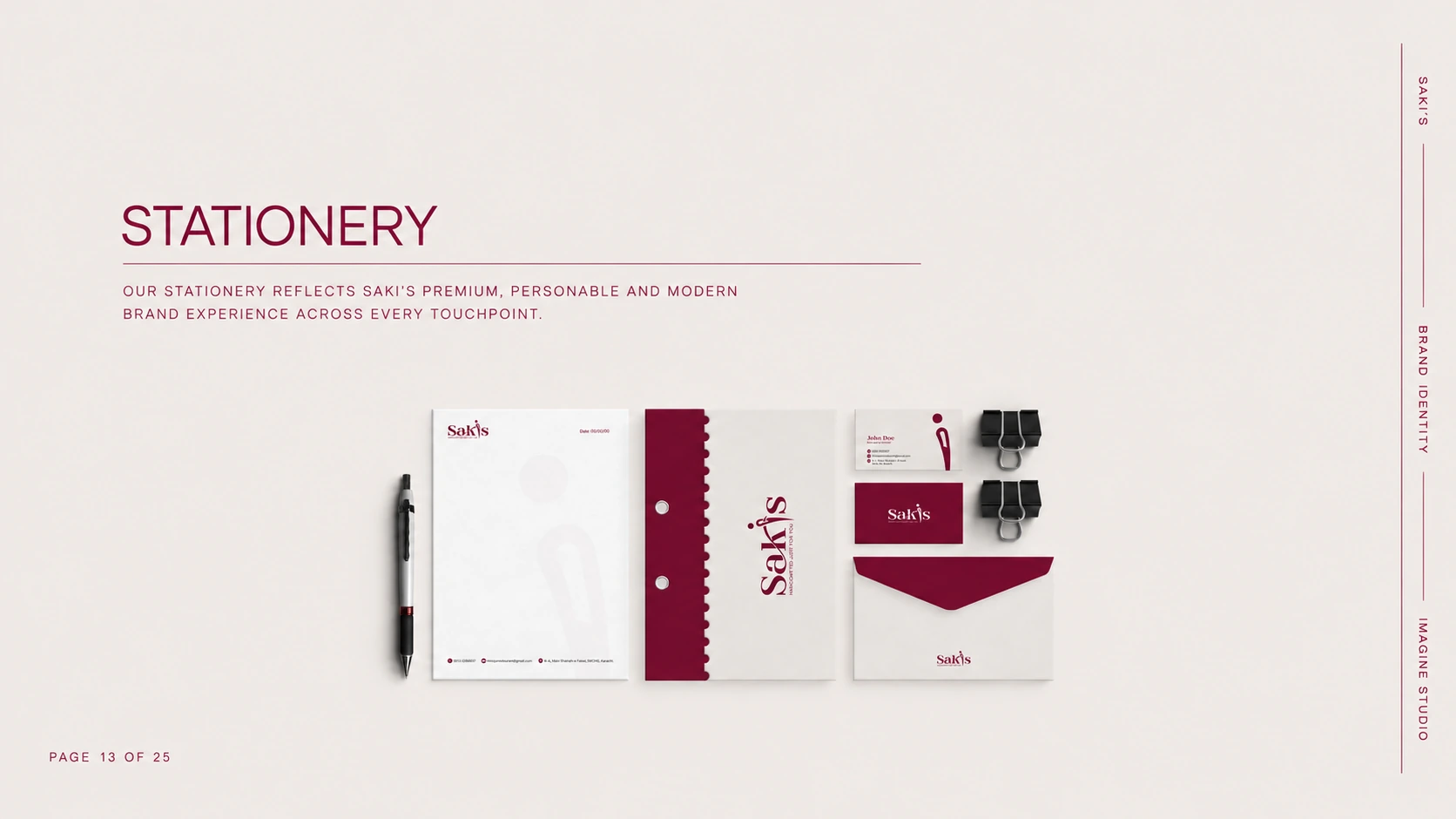
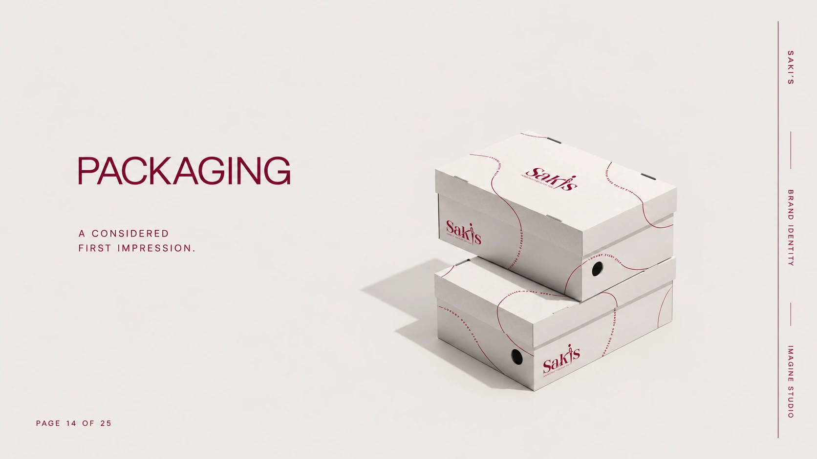
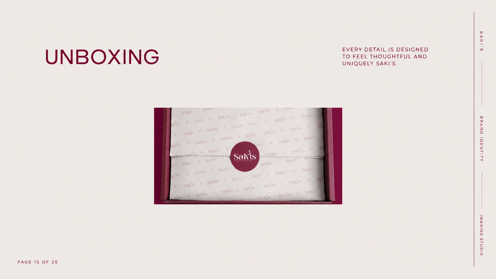
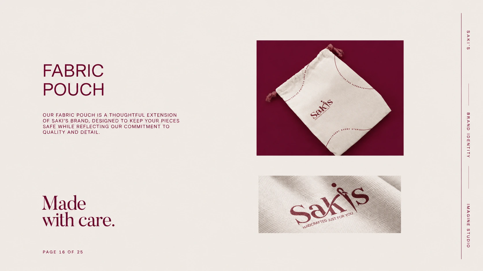
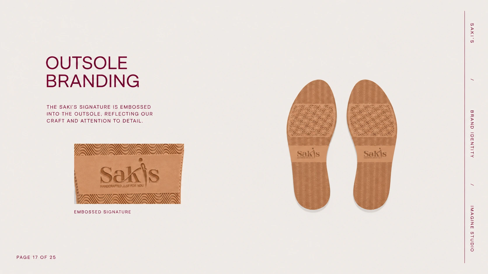
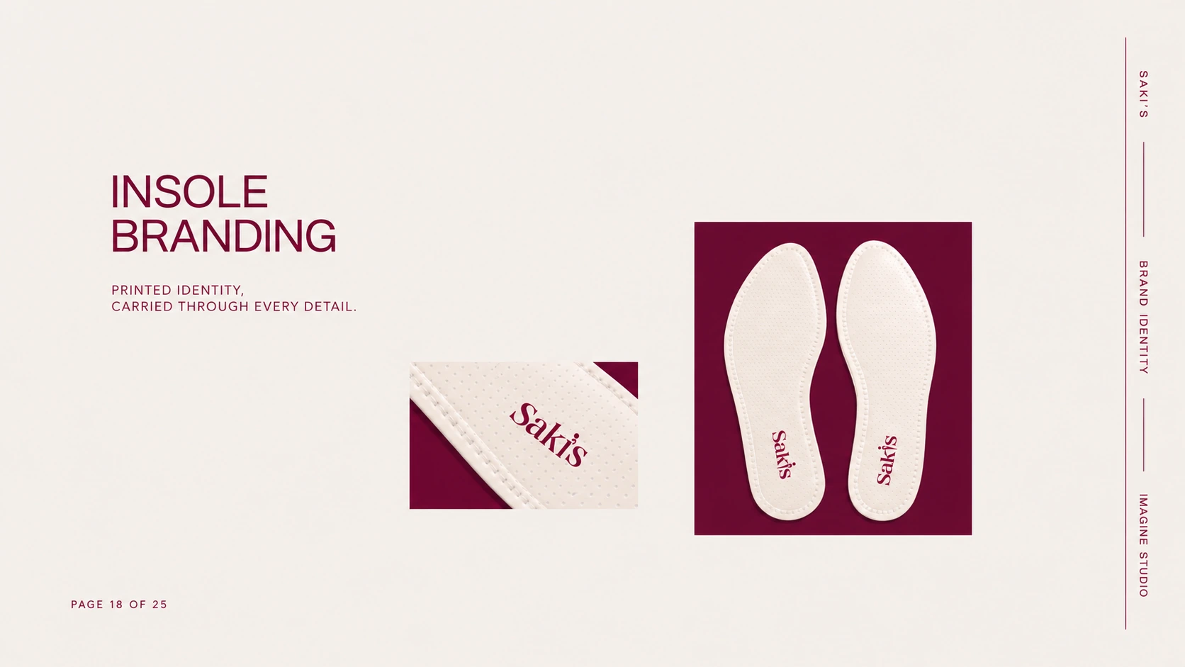
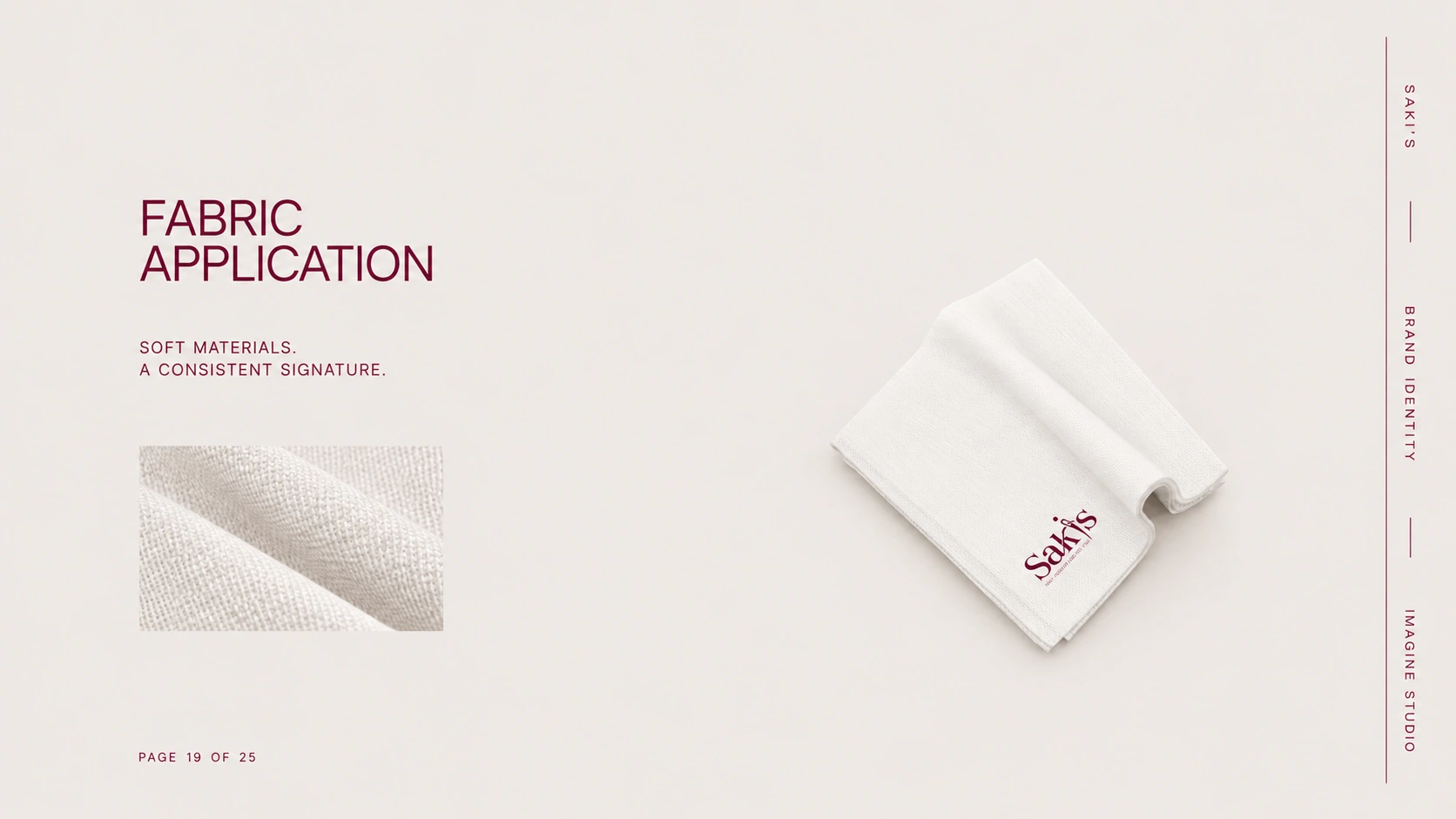
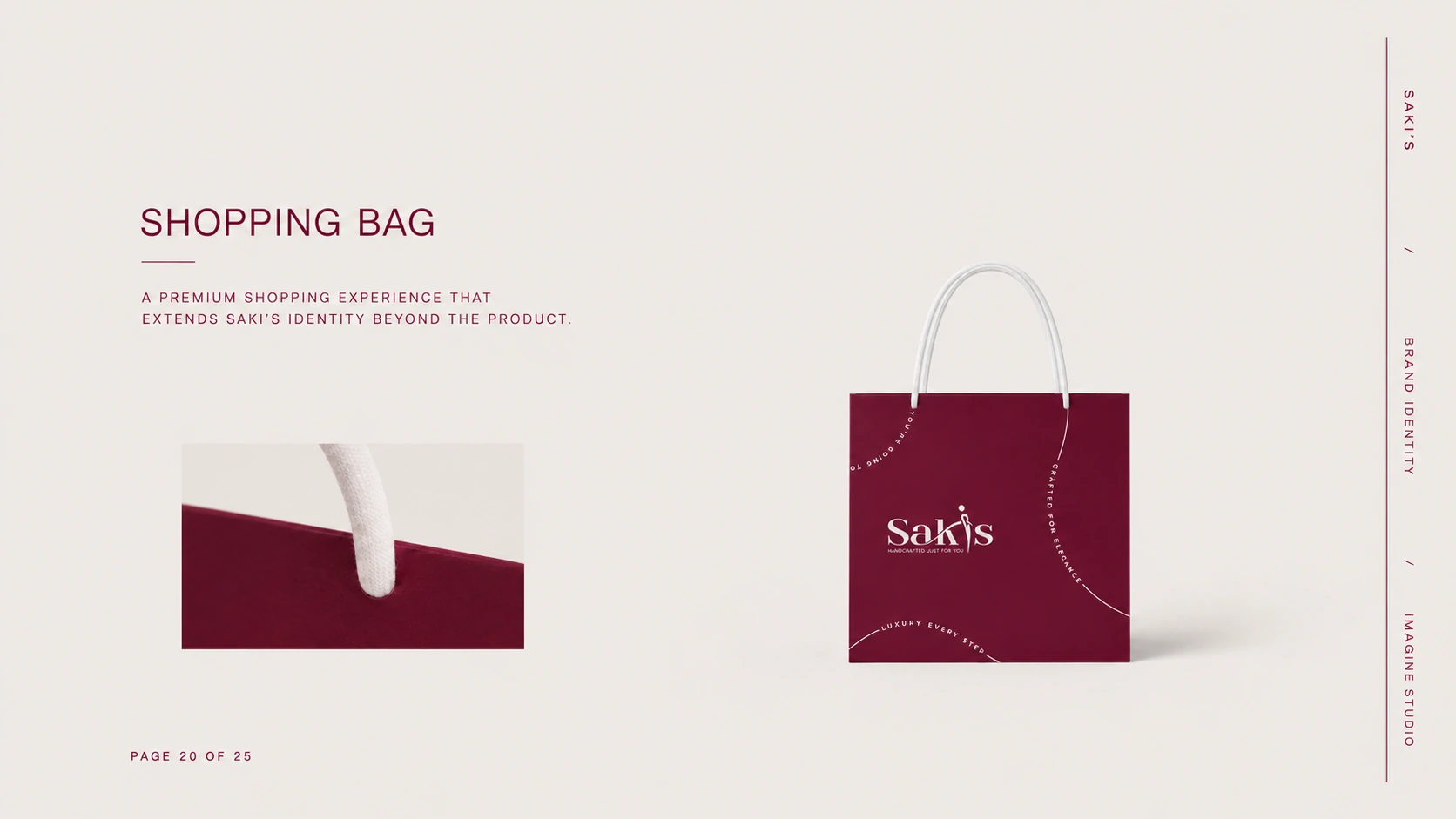
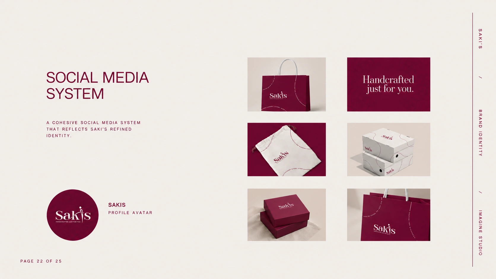
The identity extends across the full brand world: stationery, shoe boxes, tissue paper, ribbon seals, fabric pouches, branded outsoles and insoles, shopping bags, and a social media system. Repeating motifs and decorative edges tie every piece together, so Saki's stays recognisable from the boutique shelf to the customer's doorstep.
04 / SOCIAL MEDIA
A consistent presence.
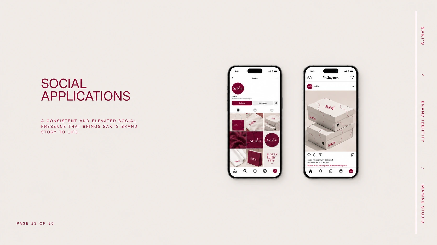
The signature figure, maroon-and-beige palette and typography extend into the profile avatar, cover layout and post templates. Together, they give the digital experience the same character as the physical brand.
05 / IDENTITY OVERVIEW
One complete brand world.
From the wordmark to the final packaging detail, every application shares a clear visual language. The complete system brings the promise of “Handcrafted just for you” into one coherent identity.
PROJECT CREDITS
Brand identity and art direction by Imagine Studio. Saki's — Handcrafted just for you.